Here is a link to a site that has lots of different types of maps of the USA
Light sources, city named Springfield, old railways. I thought it was interesting enough to share.
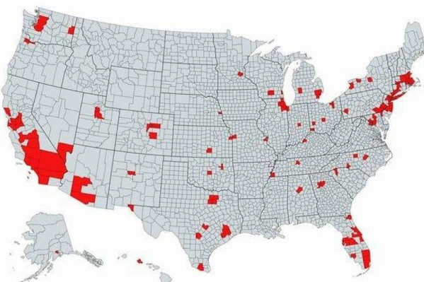
The areas on the map that are highlighted in red indicate places that have a total population that’s greater than the rest of the country combined, which is shown in gray. But I don't know if that means all red places total have more, or if each individual place has more.


So we just nuke those places because it you lay a blue overlay for a demo city, they seem to line up...
ReplyDeleteI live in the middle of Calif. in one of those red spots. Regionally we are a conservative area. The rest of it not so much.
DeleteI would suggest moving iffn' you can. How do you stand it?
ReplyDelete